
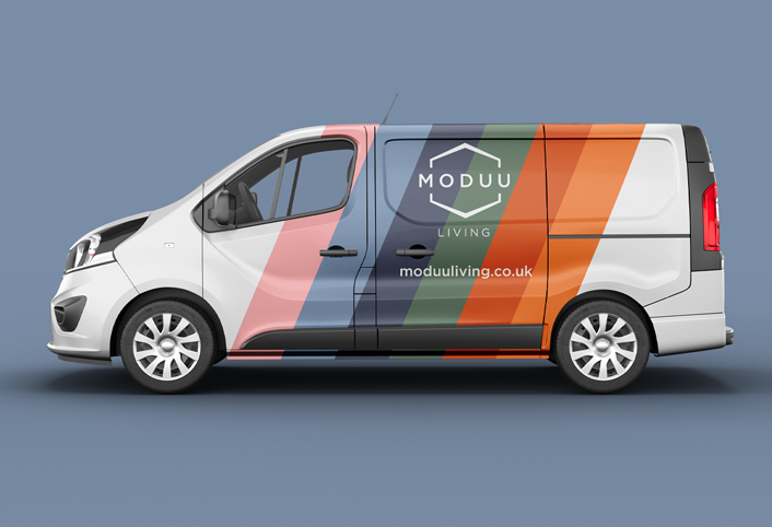
Vehicle livery design is not a checklist.
The best-known brands understand this.
Think about the AA or RAC.
Recognised instantly through consistent identity, colour and visual language.
You don’t need to read anything.
That’s exactly the point.
Others get it completely wrong.
Either no graphics at all, which feels mad when you’re driving a literal moving billboard around all day, or visual overload.
- Phone numbers
- Website addresses
- Every service they’ve ever offered
- Standalone social media icons
- Tiny unreadable text everywhere
Where do you even start, and who’s quick enough to decode all that while driving past at 30mph?
Most people won’t read any of it.
They definitely won’t remember the phone number.
Vehicle graphics are a major part of brand recognition.
The strongest approach is usually the simplest.
- A clear logo identity
- Consistent brand colours
- Recognisable visual language
- A legible website address
That’s usually enough.
A QR code can work too, if it’s thoughtfully integrated and the vehicle is likely to be parked or stationary.
And yes, how your van is driven becomes part of your brand too.
The goal is not to say everything.
The goal is to become recognisable enough that people remember your name later.
Then when they search for you, your website needs to feel familiar, consistent and unmistakably you.
That’s how visual language starts working hard for a brand.
Comments
One response to “Your vehicle fleet are moving billboards. Stop wasting them.”
[…] footers are probably one of the smallest parts of a brand, yet they’re also one of the most frequently […]